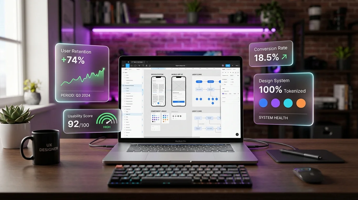
Product design has evolved far beyond visual wireframes, sleek gradients, and decorative UI mockups. In 2026, leading tech companies and high-growth digital businesses demand Product Designers and UI/UX Strategists who connect user psychology directly to sustainable business metrics. Modern design leaders must architect scalable design token systems in Figma, conduct rigorous qualitative and quantitative user research, ensure universal WCAG 2.2 accessibility, optimize Product-Led Growth (PLG) onboarding funnels, and articulate product trade-offs to engineering and C-suite stakeholders.
Whether you are preparing for a Senior Product Designer role or hiring design leadership for your team, this master guide provides the Top 35 UI/UX Design & Product Strategy Interview Questions and Scenario Answers, complete with step-by-step frameworks, design system blueprints, conversion heuristics, and executive problem-solving scenarios.
Part 1: Design Thinking, User Research & Problem Discovery (Q1–Q9)
1. How do you apply the Double Diamond framework in rapid, real-world agile product sprints?
Answer: The Double Diamond framework (developed by the British Design Council) separates product innovation into four distinct phases across two divergent/convergent diamonds:
- Discover (Divergent Thinking): Exploring the problem space without premature solutions. Conducting contextual user interviews, competitive UX audits, review mining, and analytics deep-dives.
- Define (Convergent Thinking): Synthesizing messy qualitative research into a razor-sharp Problem Statement. Developing Jobs to Be Done (JTBD) statements, user journey maps, and prioritizing the specific friction point to address.
- Develop (Divergent Thinking): Brainstorming multi-faceted solutions. Sketching low-fidelity wireframes, mapping alternative user flows, and creating interactive prototypes.
- Deliver (Convergent Thinking): Testing prototypes with real users, eliminating non-viable concepts, finalizing high-fidelity components, and handing off production-ready assets to engineering with clear acceptance criteria.
In Fast-Paced Agile: The Double Diamond is not a linear 6-month waterfall process. We execute it in Dual-Track Agile: Product Discovery runs 1 to 2 sprints ahead of Product Delivery, validating problems and testing prototypes continuously before engineering writes production code.
2. What is the Jobs to Be Done (JTBD) framework and how does it outperform traditional demographic personas?
Answer: Traditional personas often focus on superficial demographic attributes (e.g., “Sarah, 32, lives in Seattle, loves lattes, drives a Subaru”), which provides zero actionable context for why someone buys or clicks software.
The Jobs to Be Done Framework posits that people do not simply buy products; they “hire” products to make progress in a specific circumstance:
“When [Situation], I want to [Motivation/Action], so that I can [Expected Outcome/Progress].”
Why JTBD Wins: It uncovers true functional, emotional, and social causality. For example, two completely different demographic users (a 22-year-old student and a 55-year-old CFO) hire Zoom for the exact same job: “When I need to collaborate with remote colleagues without travel, I want one-click video connectivity, so that we can make decisions fast without technical setup friction.”
3. How do you balance Quantitative Data (GA4/Mixpanel) with Qualitative Research (User Interviews)?
Answer:
- Quantitative Data reveals WHAT is happening and WHERE the drop-off occurs: Funnel drop-off charts, session recordings, heatmaps, and event tracking identify that 42% of users abandon checkout on Step 2. But quantitative data cannot explain why they left.
- Qualitative Research reveals WHY it is happening and HOW users feel: Moderated usability interviews, think-aloud testing, and open-ended feedback explain that users abandoned Step 2 because the password validation requirements were ambiguous, or they feared hidden shipping fees.
- The Golden Loop: Use quantitative metrics to discover friction hotspots → deploy qualitative research to diagnose root psychological friction → prototype the solution → validate with quantitative A/B testing.
4. How do you conduct an effective Heuristic Evaluation using Jakob Nielsen's 10 Usability Heuristics?
Answer: A Heuristic Evaluation is an expert review of an interface against established cognitive usability principles:
- Visibility of System Status: Providing immediate visual feedback (loading spinners, progress bars, success toasts).
- Match Between System and Real World: Using familiar user language, real-world metaphors (trash can icon, shopping cart), and natural concepts.
- User Control and Freedom: Offering easy “Emergency Exits”: undo actions, cancel buttons, and clear escape paths.
- Consistency and Standards: Adhering to platform UI conventions (e.g., clickable links colored blue/accented, logo returning to home).
- Error Prevention: Eliminating error-prone conditions before they occur (e.g., disabling the Submit button until required inputs are valid).
- Recognition Rather Than Recall: Keeping options, actions, and elements visible so users don't have to remember info across screens.
- Flexibility and Efficiency of Use: Providing accelerators (keyboard shortcuts, bulk actions) for power users while maintaining simplicity for novices.
- Aesthetic and Minimalist Design: Eliminating clutter that competes with relevant signal; respecting whitespace.
- Help Users Recognize, Diagnose, and Recover from Errors: Plain-language error messages explaining exactly what went wrong and how to fix it.
- Help and Documentation: Contextual tooltips, searchable knowledge bases, and onboarding walkthroughs when needed.
5. What is the System Usability Scale (SUS) and how do you calculate and interpret it?
Answer: The System Usability Scale is a standardized 10-item questionnaire scored on a 5-point Likert scale (from “Strongly Disagree” to “Strongly Agree”) evaluating perceived software usability.
- Calculation: For odd-numbered questions (positive), subtract 1 from the score. For even-numbered questions (negative), subtract the score from 5. Sum all adjusted values and multiply by 2.5 to generate a normalized 0–100 score.
- Interpretation:
- > 80.3 (Grade A): World-class usability; users actively advocate for the product.
- 68.0 (Grade C / Average): The standard industry benchmark for acceptable software usability.
- < 51.0 (Grade F): Critical usability failure; severe churn and task completion breakdown.
6. What are the core WCAG 2.2 AA Accessibility requirements every modern product designer must enforce?
Answer: Accessibility (a11y) is a fundamental legal and ethical design requirement based on the POUR principles (Perceivable, Operable, Understandable, Robust):
- Color Contrast Ratios: Minimum 4.5:1 for normal text (<18pt) and 3:1 for large text (≥18pt or ≥14pt bold) against background. Non-text UI components (input borders, active icons) require at least 3:1.
- Non-Color Information Reliance: Never communicate system state via color alone. Error inputs must combine red borders with an alert icon and descriptive text.
- Focus Visible States: All interactive elements must exhibit an unmistakable, high-contrast visual focus ring when navigating via keyboard (Tab key).
- Target Size (WCAG 2.2 Criterion 2.5.8): Minimum touch target of at least 24x24 CSS pixels (ideally 44x44px or 48x48px on mobile touch screens) with sufficient spacing between adjacent tap targets.
- Semantic Heading Hierarchy: Maintain logical H1 → H2 → H3 order so screen reader users can navigate section outlines seamlessly.
7. How do you design high-converting forms that minimize cognitive load and abandonment?
Answer:
- Single-Column Layout: Multi-column forms disrupt natural vertical visual scanning and increase completion time.
- Top-Aligned Labels: Top-aligned labels yield the fastest visual saccades and lowest cognitive load compared to left-aligned labels. Avoid disappearing placeholder text as the sole label.
- Inline Real-Time Validation: Validate inputs after the user leaves the field (onBlur) rather than aggressively yelling errors while they are still typing (onChange).
- Smart Defaults & Autocomplete: Support HTML autofill attributes (
autocomplete="email",autocomplete="address-line1") and provide smart defaults where predictable. - Progressive Disclosure for Complex Flows: Chunk long enterprise forms into manageable multi-step wizards with visible progress indicators.
8. Explain the difference between Information Architecture (IA) Card Sorting vs Tree Testing.
Answer:
- Card Sorting (Generative IA): Users are given cards representing pages/topics and asked to organize them into logical groups. In Open Card Sorting, users create and name their own categories (uncovering mental models). In Closed Card Sorting, users sort cards into pre-determined categories (testing category comprehension).
- Tree Testing (Evaluative IA / Reverse Card Sorting): Users are presented with a text-only hierarchical navigation tree (stripped of visual design, colors, and search bars) and given specific tasks (e.g., “Find where you can download your monthly VAT invoices”). Tree testing measures directness, task success rate, and navigation path hesitation.
9. What is Cognitive Load Theory in UX, and how do you reduce Intrinsic, Germane, and Extraneous load?
Answer: Cognitive Load represents the mental effort required to use an interface:
- Intrinsic Load: The inherent difficulty of the task itself (e.g., calculating mortgage taxes). UX cannot remove the task, but can simplify it with calculators and visual sliders.
- Extraneous Load (The Enemy): Mental effort wasted on deciphering poor UI design: confusing navigation, unreadable fonts, distracting popups, and cluttered layouts. Designers must eliminate this entirely.
- Germane Load: Mental effort devoted to processing and integrating new information into long-term mental models. Designers support this with consistent patterns, predictable icons, and structured visual hierarchies.
Part 2: Design Systems, Figma Architecture & UI Engineering (Q10–Q18)
10. How do you architect a multi-tier Design Token system connecting Figma variables to code?
Answer: Design tokens are the foundational design decisions (colors, typography, spacing, elevation) stored as platform-agnostic data (JSON):
- Global Tokens (Tier 1 - Raw Values): Context-agnostic primitive values:
"blue-500": "#2563eb", "spacing-16": "16px", "font-sora": "Sora, sans-serif" - Semantic Tokens (Tier 2 - Purpose-Driven): Abstract tokens describing intent and role:
"color-background-primary": "{blue-500}", "color-text-error": "{red-600}", "surface-card": "{slate-900}" - Component Tokens (Tier 3 - Scoped to UI Component): Highly specific scoped variables:
"btn-primary-bg-hover": "{color-background-primary-hover}"
Bridging to Production: In Figma, variables are organized into Collection Modes (Light, Dark, High-Contrast). Automated CI/CD pipelines (via Style Dictionary or Tokens Studio) export these JSON tokens directly into Tailwind CSS configuration, CSS custom properties, and iOS/Android style sheets, ensuring 100% design-to-code synchronization.
11. How do you structure scalable Figma component libraries using Auto Layout, Variants, and Component Properties?
Answer:
- Strict Auto Layout Everywhere: Every frame must use Auto Layout with responsive resizing rules (Hug Contents, Fill Container, Fixed) so components dynamically adapt to variable content lengths and localized translations without breaking.
- Component Properties Over Variant Bloat: In legacy Figma setups, creating variants for icons and states resulted in bloated components with 200+ combinations. Modern architecture uses Boolean Properties (Show/Hide icon), Instance Swap Properties (Swap icon asset), and Text Properties (Edit label in sidebar), reducing variant counts by 80%.
- Atomic Design Hierarchy: Structure components from Atoms (icons, buttons, inputs) → Molecules (form fields with labels & helper text) → Organisms (navigation bars, table cards) → Templates (page shells).
12. What are the core UX Interaction Laws: Fitts's Law, Hick-Hyman Law, and the Doherty Threshold?
Answer:
- Fitts's Law: The time required to rapidly move to a target area is a function of the target's distance and size.
UX Application: Make primary CTA buttons large and place mobile navigation actions within easy reach of the user's thumb (bottom screen navigation bars). - Hick-Hyman Law: The time it takes to make a decision increases logarithmically with the number and complexity of choices.
UX Application: Limit navigation dropdown choices; break long multi-option menus into categorized sub-steps to prevent analysis paralysis. - The Doherty Threshold: Productivity soars when a computer and its users interact at a pace (<400ms) that ensures neither has to wait on the other.
UX Application: Provide instant optimistic UI feedback upon click, skeleton loaders during network latency, and micro-animations to keep perceived latency below 400ms.
13. How do you design a cohesive, accessible Dark Mode theme without merely inverting colors?
Answer: Pure color inversion produces blinding high-contrast designs with vibration effects. Professional Dark Mode design requires deliberate elevation systems:
- Avoid Pure #000000 Black for Surfaces: Use deep dark gray or slate (e.g.,
#121212,#0f172a) to reduce eye strain and allow subtle drop shadows to remain visible. - Elevation via Lightness, Not Shadows: In light mode, higher surface elevation is communicated via darker drop shadows. In dark mode, higher elevation layers must be communicated by making surfaces progressively lighter (e.g., Base background:
#0a0a0a; Card:#1a1a1a; Modal dialog:#262626). - De-Saturate Vibrant Accent Colors: Highly saturated brand colors (e.g., bright electric blue or vivid orange) vibrate aggressively against dark backgrounds. Tone saturation down by 15–20% to pass WCAG contrast without visual fatigue.
14. What are Micro-Interactions and what is the 4-part framework behind them?
Answer: Micro-interactions are subtle, single-purpose product moments (e.g., toggling a switch, liking a post, pulling down to refresh) defined by Dan Saffer's 4-part framework:
- Trigger: The initiator of the micro-interaction (user-initiated: tapping a heart icon; or system-initiated: battery reaching 10%).
- Rules: What happens when the trigger fires (the toggle slides right; the heart scale increases by 1.2x; an API request is dispatched).
- Feedback: How the user perceives the rule executing (haptic vibration on mobile, subtle spring animation, color change from gray to red).
- Loops & Modes: The meta-rules governing repetition and state over time (e.g., does the animation re-trigger if tapped again, or does it toggle off?).
15. How do you design for the Mobile-First “Thumb Zone” and gesture interactions?
Answer: Based on Steven Hoober's mobile ergonomics research, 75% of users navigate smartphones using a single thumb.
- The Natural Zone (Bottom & Center): Place primary navigation tabs, main CTA buttons, and search inputs in the bottom 40% of the screen where the thumb rests naturally without hand strain.
- The Stretch Zone (Middle): Suitable for secondary content consumption and scrolling card grids.
- The Hard-to-Reach Zone (Top Corners): Reserve top corners exclusively for infrequent, destructive, or passive actions (Close “X”, Settings gear). Avoid placing primary confirmation buttons in the top right corner.
16. How do you ensure design-to-code parity during engineering handoff?
Answer:
- Interactive Storybook Integration: Ensure Figma components map 1-to-1 with live code components in Storybook using matching naming conventions and property props.
- Annotate Responsive Breakpoints: Deliver layouts with explicit breakpoint rules: Mobile (375px), Tablet (768px), Desktop (1280px), Ultra-Wide (1600px).
- Specify Edge States & Micro-Copy: Never hand off only the “Happy Path”. Every component must document: Loading state, Empty state, Error state, Disabled state, and Maximum Text Overflow truncation rules.
17. What is Responsive vs Adaptive vs Fluid Typography and Grid Systems?
Answer:
- Responsive Design: Layout components jump between fixed layout parameters at distinct screen width breakpoints (e.g.,
@media (min-width: 768px)). - Adaptive Design: The server detects the device type (mobile, tablet, desktop) and delivers completely separate, tailored UI templates.
- Fluid Typography (CSS
clamp()): Text scales smoothly and proportionally between minimum and maximum viewport sizes without abrupt breakpoint jumps:font-size: clamp(1.25rem, 1rem + 2vw, 2.5rem);
18. How do you design accessible Empty States that convert rather than dead-end users?
Answer: An empty state occurs when a user lands on a screen with zero data (e.g., a newly created dashboard, empty shopping cart, or empty search results). A great empty state features 4 elements:
- Empathic Visual Anchor: A welcoming illustration or icon establishing contextual warmth.
- Clear Informational Explanation: Plain explanation of why the screen is empty (e.g., “You haven't created any campaigns yet.”).
- Clear Value Proposition: Remind the user of the benefit of taking action (“Launch your first campaign in 2 minutes to start tracking SEO rankings.”).
- Single Primary Action (CTA): A prominent button driving immediate progress:
[+ Create Your First Campaign], ideally pre-populating starter templates.
Part 3: Product Strategy, Product-Led Growth (PLG) & Business Alignment (Q19–Q27)
19. What is Product-Led Growth (PLG) and how does UX design drive customer acquisition and expansion?
Answer: In traditional Sales-Led Growth, buyers interact with sales reps and request demos before ever touching software. In Product-Led Growth (PLG), the product itself is the primary driver of acquisition, retention, and monetization.
The UX Designer's Role in PLG:
- Minimizing Time-to-Value (TTV): Eliminating friction between signup and the user's first successful outcome.
- Designing the “Aha! Moment”: Identifying the exact emotional tipping point where a user experiences the core product value (e.g., for Slack: sending 2,000 messages; for Dropbox: saving 1 file to folder).
- In-Product Viral Loops: Embedding natural collaboration loops (e.g., Figma: inviting a colleague to a live board; Loom: sharing a video link that prompts the viewer to sign up).
- Frictionless Upgrade Triggers: Designing contextual upgrade prompts at moments of high intent (e.g., reaching a storage limit or accessing a premium integration) rather than annoying paywalls.
20. Compare Freemium vs Free Trial vs Reverse Trial onboarding models.
Answer:
| Onboarding Model | UX Mechanics | Pros | Cons & UX Risks |
|---|---|---|---|
| Freemium | Free forever with feature or usage caps (e.g., Spotify, Notion, Slack). | Massive top-of-funnel user acquisition; organic network effects. | High infrastructure cost; low free-to-paid conversion rates (typically 2–5%). |
| Free Trial | Full access to product for a limited time (e.g., 14 or 30 days). | Creates urgency to evaluate product features quickly. | Users drop off if they fail to reach the “Aha! Moment” before the clock expires. |
| Reverse Trial (Modern PLG) | New users start on the full Enterprise plan for 14 days, then downgrade to Freemium if they don't buy. | Users experience maximum product power and premium features before gracefully falling back. | Requires careful UX communication so users aren't confused when advanced features lock. |
21. How do you prioritize product features using the RICE, Kano, and MoSCoW frameworks?
Answer:
- RICE Scoring:
RICE Score = (Reach × Impact × Confidence) / Effort- Reach: How many users will this feature affect in a given timeframe?
- Impact: Massive (3x), High (2x), Medium (1x), Low (0.5x), Minimal (0.25x).
- Confidence: 100% (high empirical data), 80% (moderate research), 50% (gut intuition).
- Effort: Estimated engineering person-months.
- The Kano Model: Categorizes features into:
- Must-Haves (Basic): Features taken for granted (e.g., password reset); absence causes dissatisfaction, presence does not increase delight.
- Performance (Linear): More is better (e.g., speed, export limits).
- Delighters (Excitement): Unexpected innovations that create immense brand loyalty.
- MoSCoW Method: Must Have, Should Have, Could Have, Won't Have (this release).
22. How do you design for Activation and Time-to-Value (TTV) in SaaS onboarding?
Answer: Time-to-Value (TTV) is the elapsed time from initial account creation until the user achieves their first meaningful benefit.
UX Strategies to Slash TTV:
- Eliminate Upfront Account Verification Friction: Let users experience the product before demanding email confirmation or credit card entry.
- Curated Role-Based Personas: Ask 1 to 2 diagnostic onboarding questions (e.g., “What is your primary goal? [ ] Manage SEO [ ] Audit Content [ ] Track Rankings”) and customize the default dashboard layout to match that goal.
- Interactive Checklists: Provide a gamified 4-step setup checklist with progress bars. Psychology shows users love completing pre-started progress bars (the Goal-Gradient effect).
- Pre-Populated Demo Templates: Never drop a new user into an empty, blank canvas. Provide interactive demo projects with dummy data that users can edit immediately.
23. How do you avoid “Dark Patterns” (Deceptive UX) while still maximizing business conversions?
Answer: Dark Patterns (Deceptive Design) trick or coerce users into making decisions they didn't intend to make (e.g., hidden subscription renewals, confusing cancelation flows / Roach Motels, sneak-into-basket add-ons, or guilt-tripping confirm-shaming).
Why Deceptive UX Destroys Business Value: While deceptive patterns might spike short-term signups, they destroy customer trust, drive massive credit card chargebacks, generate negative public sentiment, and trigger severe legal penalties (FTC enforcement).
The Ethical Conversion Alternative: Create high-converting designs through Clarity, Value, and Friction Reduction: transparent pricing, one-click self-serve cancelations, proactive billing reminder emails, and compelling value propositions that earn repeat purchases legitimately.
24. What are North Star Metrics, and how do you align UX design initiatives with them?
Answer: A North Star Metric (NSM) is the single key metric that best captures the core value a product delivers to its customers and serves as the leading indicator of long-term sustainable revenue.
- Spotify: Time spent listening to music.
- Airbnb: Nights booked.
- Slack: Daily active teams sending messages.
- How UX Connects: Designers break the North Star Metric down into supporting input metrics (e.g., Task Completion Rate, Onboarding Activation Rate, Feature Adoption Rate). When designing a streamlined playlist creation flow, the UX designer directly increases “Time spent listening”.
25. How do you balance User Research desires against Business Monetization requirements?
Answer: Users will naturally state in interviews that they want zero ads, infinite free storage, and zero subscription costs. The product designer's role is not to fulfill every customer demand uncritically, but to understand the underlying problem and solve it within a viable business model.
Framework: Seek the intersection of User Desirability, Technical Feasibility, and Business Viability. If the business must introduce monetization, design a transparent, value-aligned model where paying users receive disproportionate productivity gains rather than penalizing free users.
26. How do you design for AI-Native Interfaces (Conversational UX, Generative UI & Uncertainty)?
Answer: Designing for generative AI requires abandoning rigid, deterministic UI assumptions in favor of dynamic probabilistic interfaces:
- Contextual Prompt Starters: Users suffer from “Blank Prompt Paralysis”. Provide curated, single-click prompt chips based on current user context.
- Generative UI (Dynamic Widgets): Instead of plain walls of chat text, generate structured UI cards, interactive sliders, data tables, and diagrams inline.
- Designing for Uncertainty & Hallucinations: Visually communicate confidence levels, provide direct source attribution citations, and give users one-click tools to edit, regenerate, or verify AI outputs.
- Keep the Human in the Loop: For critical actions (e.g., publishing a campaign, deleting database entries), always require explicit human confirmation.
27. How do you collaborate with CRO Specialists to run rigorous A/B experiments?
Answer: Great design is a hypothesis waiting to be empirically validated:
- Hypothesis Formulation: “Because user testing revealed shoppers hesitate over shipping costs on product pages, moving estimated delivery dates and free shipping badges directly beneath the 'Add to Cart' button will increase checkout initiation by 12%.”
- Isolate Variables: Avoid redesigning 10 elements at once in an A/B test. Test isolated, high-leverage variations so you can pinpoint the exact psychological driver of conversion lift.
- Statistical Significance: Ensure tests run until achieving 95% statistical confidence with adequate sample size, avoiding premature termination caused by day-of-week volatility.
Part 4: Executive Problem-Solving & High-Stakes Scenarios (Q28–Q35)
28. Scenario: A B2B SaaS onboarding flow suffers a 65% drop-off between signup and project creation. Walk through your discovery, audit, and redesign strategy.
Answer:
- Data Triangulation: Inspect funnel analytics in Mixpanel/GA4. At which exact input field or screen does the 65% drop occur? Review 50 FullStory/Hotjar session recordings to observe where users rage-click, hesitate, or abandon.
- Rapid User Interviews: Schedule 5 moderated 20-minute usability interviews with users who recently dropped off, offering an incentive. Ask them to walk through the signup flow and share their internal monologue.
- Root Cause Diagnosis: Identify friction vectors: is the product demanding sensitive information (e.g., company credit card, phone number, API keys) before proving value? Are there too many mandatory form fields?
- Redesign Solution:
- Defer non-essential inputs until after initial project setup.
- Replace the blank setup canvas with pre-built, industry-specific starter templates.
- Introduce a 3-step progress bar highlighting that setup takes under 60 seconds.
- Validation: Deploy an A/B test against the control flow and monitor activation rates and 30-day retention.
29. Scenario: Stakeholders insist on adding an intrusive full-screen modal to capture email addresses on page load. How do you counter and propose user-centric alternatives?
Answer:
- Highlight Business & SEO Risks: Explain objectively that immediate full-screen interstitials spike bounce rates by 25%+, degrade mobile Core Web Vitals, and violate Google's Intrusive Interstitial penalty guidelines, which risks organic search rankings.
- Reframe Around Intent: Users cannot assess whether they want a newsletter before they have read a single sentence of content. Demanding email on second zero produces low-quality, throwaway email addresses.
- Propose High-Performing Alternatives:
- Scroll-Depth / Exit-Intent Triggers: Trigger the opt-in modal only when a visitor scrolls past 60% of an article, or signals exit intent on desktop.
- Inline Value-Add Callouts: Embed native, styled lead-magnet download boxes directly within the article body offering a relevant template or checklist.
- Offer an A/B Test: Test the stakeholder's immediate popup against the scroll-depth inline box, measuring not just raw email signups, but 30-day retention, bounce rates, and organic SEO traffic health.
30. Scenario: Engineering says your design system redesign will delay the sprint roadmap by 6 weeks. How do you negotiate?
Answer:
- Acknowledge Constraints: Never treat engineering constraints as an obstacle; treat them as design parameters. A design that cannot be built on schedule is a flawed design.
- Phase-Based Delivery (Slice the Elephant): Decompose the design system overhaul into phased, high-ROI increments:
- Phase 1 (Sprint 1): Foundational design tokens (colors, typography, spacing variables). Minimal engineering overhead, immediate visual consistency.
- Phase 2 (Sprint 2): High-frequency core atoms (Buttons, Input fields, Badges).
- Phase 3 (Sprint 3–4): Complex molecules and legacy view refactors rolled out progressively as features are naturally touched.
- Quantify Long-Term Efficiency: Show that investing in shared design tokens will accelerate future frontend feature delivery by 30% and eliminate redundant CSS refactoring.
31. Scenario: User research feedback directly contradicts the VP of Product's pet feature idea. How do you handle the conversation?
Answer:
- Depersonalize the Conflict: Frame the conversation around the customer and the shared business objective, not “Design vs Product Management”.
- Present Evidence Over Opinion: Share raw video snippets from user testing sessions and usability task failure metrics. Nothing cuts through executive assumptions faster than watching 4 consecutive target customers fail to understand a feature.
- Validate the Underlying Business Goal: Understand what business outcome the VP was attempting to achieve (e.g., increasing retention or showcasing an enterprise feature).
- Propose a Collaborative Pivot: Suggest a redesigned approach that achieves the VP's underlying business metric while aligning with the authentic user mental model uncovered in research.
32. Scenario: Redesigning a legacy enterprise platform with thousands of daily power users resistant to change. How do you avoid user revolt?
Answer: Power users develop deep muscle memory and keyboard shortcut reflexes over years. Forcing a sudden redesign disrupts their daily livelihood and triggers immense backlash (the “Digg v4 / Snapchat redesign disaster”).
The Phased Migration Protocol:
- Early Co-Creation: Involve power users early through an invite-only Beta program, conducting regular feedback councils.
- Opt-In Dual Experience: Launch the new interface with a prominent toggle bar:
[Try the New Experience]/[Switch Back to Classic]. Allow users to toggle back while collecting diagnostic feedback on why they switched back. - Preserve Muscle Memory & Keyboard Accelerators: Keep critical keyboard shortcuts and high-frequency button positions stable.
- Contextual Micro-Walkthroughs: When the new UI is first launched, show interactive tooltips pointing to where legacy features now live.
- Transparent Sunset Timeline: Announce the eventual retirement of Classic mode 6 months in advance, only pulling the switch once 90%+ of daily active users have voluntarily transitioned.
33. Scenario: Conducting a post-launch retrospective when an A/B tested redesign yields unexpected negative engagement.
Answer:
- Embrace Blameless Post-Mortem Culture: A failed experiment is not a failure; it is valuable validated learning about customer behavior.
- Segment the Data: Often, an aggregate “negative” result masks positive performance in specific cohorts. Segment results by New Users vs Returning Users, Mobile vs Desktop, and Traffic Source. Frequently, new users love the redesign, while returning users struggled with unfamiliar layouts.
- Deploy Qualitative Intercepts: Trigger a 1-question micro-survey to users abandoning the variant screen: “What were you trying to accomplish today?”
- Iterate Rapidly: Formulate a refined hypothesis incorporating the new failure data, make targeted adjustments, and re-test.
34. Scenario: Building a cohesive UX culture across decentralized product squads. How do you prevent fragmented UI drift?
Answer:
- Design System Governance Guild: Form a cross-squad Design System council that meets bi-weekly to review component contribution requests, evaluate token consistency, and approve new patterns.
- Centralized Figma Library with Strict Versioning: Maintain a single source of truth in Figma with clear release notes for breaking component changes.
- Bi-Weekly Design Critiques (Crits): Foster an open studio critique culture where designers from different squads present work-in-progress early, spotting overlapping UI patterns before engineering kickoff.
- Shared UX Principles: Establish 3 to 5 company-wide UX tenets (e.g., “Speed over ornamentation”, “Clarity through defaults”) that serve as objective evaluation rubrics across all squads.
35. Scenario: How do you measure and prove the ROI of UX Design to executive leadership?
Answer: Never report design ROI using subjective aesthetics (“The UI looks cleaner and more modern”). Speak exclusively in quantifiable business outcomes:
- Conversion Lift: Proving that the checkout redesign increased funnel conversion by 1.8%, contributing $650,000 in incremental revenue.
- Reduction in Customer Support Ticket Volume: Demonstrating that clarifying the billing settings UI decreased “How do I update my card?” support tickets by 42%, saving 120 support agent hours per month.
- Engineering Efficiency Gains: Showing that modular design system tokens reduced frontend feature development time from 4 weeks to 2.5 weeks per sprint.
- Retention & LTV Expansion: Correlating improved onboarding SUS scores with a 15% increase in 90-day user retention.
UX Metrics, Research Methodologies & Tooling Matrix
| Design & Strategy Vector | Primary Methodologies | Target Benchmark Metric | Industry Standard Tooling |
|---|---|---|---|
| User Research & Discovery | Contextual inquiry, JTBD interviews, diary studies | 5–8 interviews per customer segment for 85% problem discovery | UserTesting, Dovetail, Grain |
| Usability & Architecture | Moderated think-aloud tests, Tree testing, Card sorting | SUS score > 75; Task Completion Rate > 85% | Maze, Optimal Workshop, Lookback |
| Design Systems & Tokens | Atomic tokens, variables, component properties | 100% token parity between Figma & Storybook | Figma, Tokens Studio, Storybook, Zeroheight |
| Accessibility (a11y) | Automated axe audits, screen reader navigation | 100% WCAG 2.2 AA compliant; Contrast ≥ 4.5:1 | Axe DevTools, Stark, VoiceOver, NVDA |
| Product Growth & PLG | Funnel analysis, session recordings, A/B testing | Time-to-Value (TTV) < 5 mins; Activation > 40% | Mixpanel, Amplitude, PostHog, Hotjar |
Frequently Asked UI/UX Interview FAQs
Q: How do I structure my portfolio case studies for senior design interviews?
A: Structure your case study like an executive story: 1) Context & Business Problem, 2) Constraints (timeline, tech debt), 3) User Research Insights, 4) Divergent Explorations & Pivots, 5) Final Shipped Solution, 6) Measured Business Outcomes & Metrics, and 7) Lessons Learned. Avoid dumping 40 unannotated Figma screenshots without rationale.
Q: What is the most critical quality interviewers evaluate in senior product designers?
A: Strategic rationale and commercial empathy. Top companies want designers who understand how design decisions impact business unit economics, how to navigate trade-offs, and how to defend design decisions with data rather than personal taste.