add shadow to border css
Here is a simple code to generate Box shadow. Use the custom CSS option in the Theme editor and create the box-shadow bottom, left, right and or top. Just change the values for your convenience to create suitable effects for your theme.
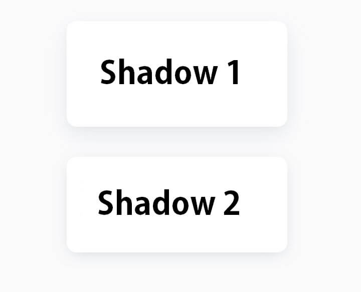
Below we gave a code with example of the Box image, Have a try and enjoy the design.
Box Shadow 1
box-shadow: 0 5px 10px rgba(154,160,185,0.05),
0 15px 40px rgba(166,173,201,0.2);
Box Shadow 2
box-shadow: 0 7px 30px -10px rgba(150,170,180,0.5);

Let’s try to add shadows to the text, So that we have the Element We checked the open sidebar and found the True Shadow Never mind this place, we Text shadow and box shadow can be managed so great in this section first let’s add text shadow by double-clicking Offset x Blur color can be set, So that offset sum and offset correct y can change the blur And We can change the color to our div, and You can add multiple values to the shadows by clicking the plus button, well we will see the effect on this element in this DV.
We change the changing rate We will try at Box Shadow for example And We make a great impression that you can change this shade in Inset We will see, so we can see if you can change the color of the blue spread OK then we have an example We will now select the Gradient tab as we try on Gradient We see the basic settings of the gradient Linear Gradient repeating radial gradient And select the type of gradient such as repeating radial gradient And at the bottom we can set the colour and location When we start this color we also add several values And most of these are the gradients for our HTML alignment The app is automatically in the background-image property, so We don’t have to worry about adding it manually, We try with basic gradient We need to double-click on this gray name, and we get the value And even the color Can change, which I can change too You can add new values and Many gradients can be added, which are buttons And that’s all right for now
add shadow to border css – Setp 2
Box Shadow in CSS:
The box-shadow property in CSS allows you to add a shadow effect to an element. It takes several values, such as horizontal and vertical offset, blur radius, spread radius, and color. Here’s a basic example:
/* Syntax: box-shadow: offset-x offset-y blur-radius spread-radius color; */
.element {
  box-shadow: 5px 5px 10px 0 rgba(0, 0, 0, 0.3);
}
offset-xandoffset-y: These values control the horizontal and vertical offsets of the shadow.blur-radius: Determines the blurriness of the shadow.spread-radius: Adjusts the size of the shadow.color: Specifies the color of the shadow.
Border Shadow in CSS:
If you mean a border-like shadow around an element, you might be looking for the border and box-shadow combination:
.element {
  border: 2px solid #ddd; /* Border color */
  box-shadow: 0 0 10px rgba(0, 0, 0, 0.1); /* Box shadow */
}
In this example, a solid border is added to the element using the border property, and a subtle box shadow is applied using the box-shadow property.
Feel free to adjust the values and colors according to your design preferences. The box-shadow property is quite versatile, allowing you to create various shadow effects for different elements on your webpage.


